micro-interactions.
Spring 2020 - 15 weeks
This semester-long project asked us to create or choose a brand identity, and make different types of micro-interactions that were so silly they bordered on useless. The idea was to build something that brings joy, whether or not it has an actual function.
To view my complete process, check out this pdf!
defining the look
We started out by picking our brand, and I chose Burt’s Bees. I am an avid user of their products, and I really enjoy their natural, friendly image. In making my mood board and style board, I (predictably) chose to utilize a lot of yellows and geometric textures, to foster the idea of bees, their hives, and their honey.

Mood Board

Style Board
buttons
Our first interaction was a big, decorated button. This would be one of the first thing the users see, and set the tone for the brand as well as the rest of the interactions. I designed mine as if it would have to be used to enter the website before the user starts shopping.
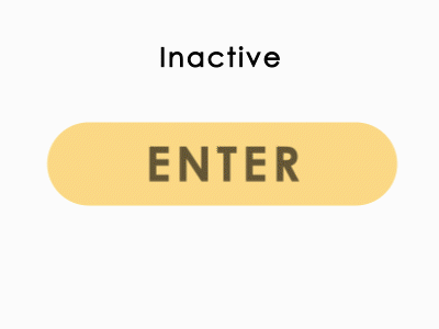
Enter Button
toggles
Next was toggles, of which we made three variations. One was a simple on/off switch, which I designed to be used to opt in or out of website settings such as sound.
The second was a multi state toggle, which I made to be page navigation.
Finally I made the slider, to be used to change the amount of product added to your cart.
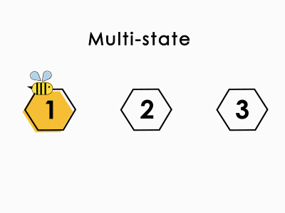
Various toggles
radio buttons & check boxes
Our final interactions were radio buttons and check boxes, which are simple yet important.
Since radio buttons can only have one selected at a time, I made them options for price range. For check boxes, I allowed the user to select multiple skin types.
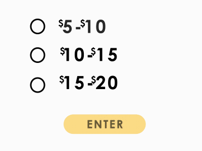
Radio buttons and checkboxes
next steps
I really enjoy the visual style that I’ve achieved, but moving forward, I want to provide more cues for my user to know what it is they’re supposed to be doing. I can likely achieve this by having more prominent distinctions between states, i.e. hover, inactive, and so on.